Background
About the company
Google Fiber/GFiber is a high-speed broadband internet service that uses fiber optic cable, and wave tech to deliver fast internet right to homes and businesses.
Started by Google, Google Fiber Inc. is now a subsidiary of Alphabet and services a growing number of households in 13 cities in 10 states across the United States. In 2024, Google Fiber is estimated to deliver internet to about 4.1 million people.
Products
Residential and business internet provider, with broadband services with both fiber-optic and fixed wireless technology. Customer service department focus for this project.
Scenario
Google business intelligence:
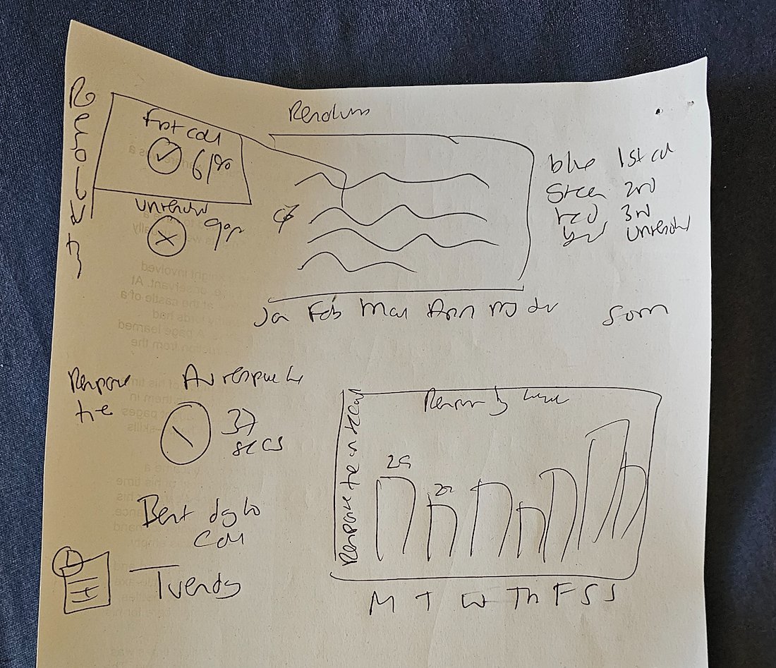
The stakeholder is the Google Fiber Customer Service Team. The team needs to understand how often customers phone customer support again after their first inquiry; this will help leaders understand whether the team is able to answer customer questions the first time.
Further, leaders want to explore trends in repeat calls to
identify why customers are having to call more than once, as well as how to
improve the overall customer experience. I will create a dashboard to reveal
insights about repeat callers.
Problem Statement
The team wants to answer these questions:
- - How often does the customer service team receive repeat calls from customers?
- - What problem types generate the most repeat calls?
- - Which market city’s customer service team receives the most repeat calls?
Business Case
- Understanding repeat calls helps to pinpoint a plethora of issues.
- Firstly understand volumes and the landscape
- Understand the problem major issues causing calls
- See which customer teams are carrying which calls
- Improve resolution to increase customer satisfaction
- Increase training and resources to increase not only first call resolution but also product satisfaction.
- Motivate staff
- Feed the information back to product and documentation teams
- Update FAQs
Goals/Metrics
The team’s ultimate goal is to reduce call volume by increasing customer satisfaction and improving operational optimization. My dashboard should demonstrate an understanding of this goal and provide stakeholders with insights about repeat caller volumes in different markets and the types of problems they represent.
Dashboard Dataset
The project data consisted of 3 separate datasets. These were imported into Big Query, checked and via Union All were combined into one dataset. This CSV dataset was then imported into Tableau for visualisation.
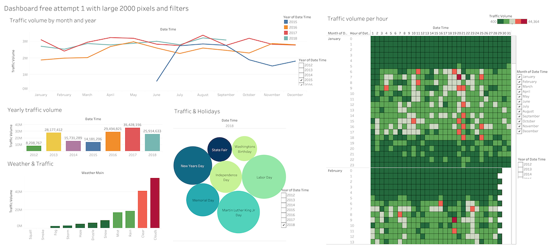
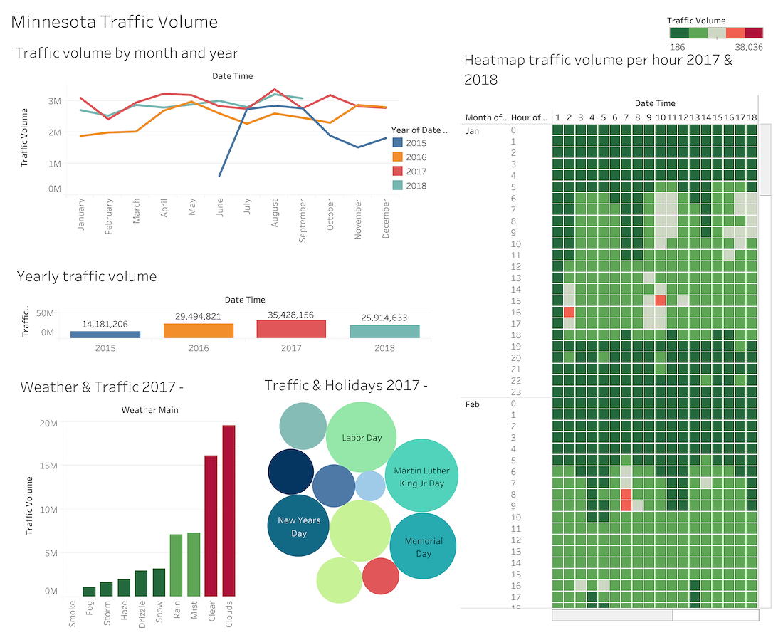
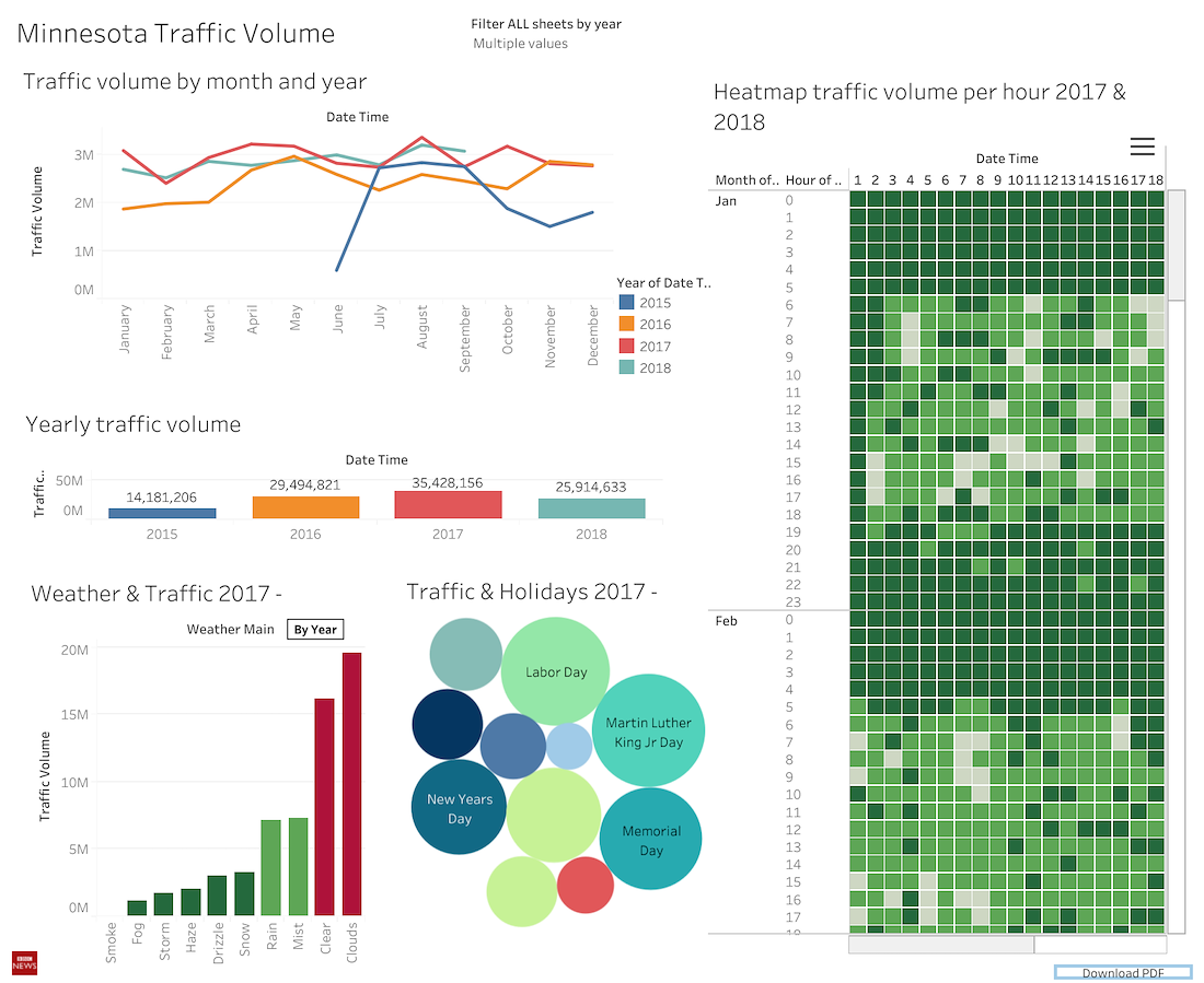
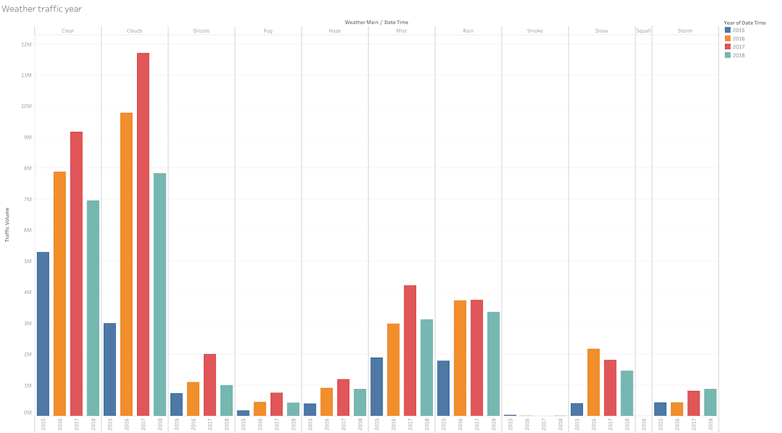
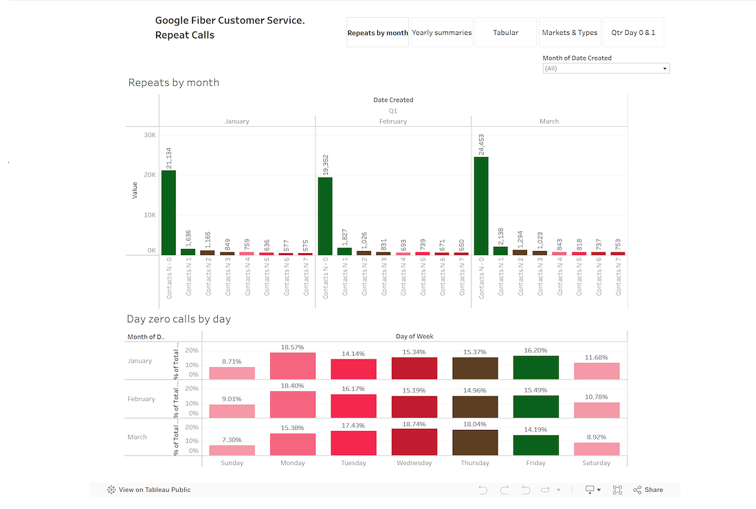
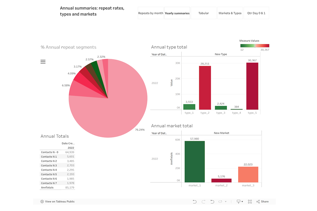
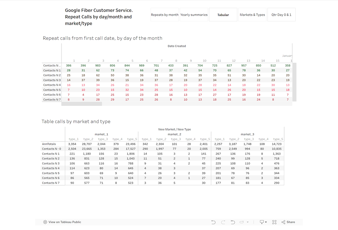
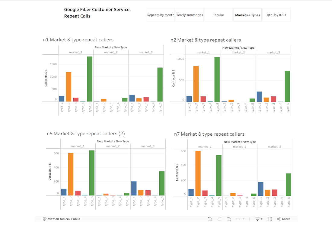
Dashboard and results
As an early project I decided to give a give a multi set dashboard. This combined not only a day of the week and weekly operational level but also an annual level. This makes it easy for all levels to see what is happening at several different points. Monthly and annual results are quite different.
The client can then pick options and allocate levels. I anticipate that the annual page would not be available for some users.
See also the executive summary.
The dashboard and executive summary can be seen below.


/background(fff)/1100x1426.jpeg?auto=webp)