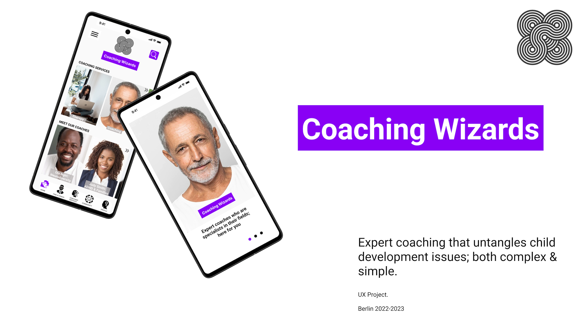
Coaching Wizards
Is an app for kids and parents that are trying to deal with developmental issues such as neurodiversity, social problems, dysmorphia, gender, sexual interaction amongst others.
Coaching Wizards offers expert coaching that untangles these developmental issues, whether they are simple or complex and allows the kids to deal with or solve them.
Why this subject?
When I grew up in the UK there was not the understanding about neurodiversity and issues that there is now. I saw some kids get left behind or were not able to socially succeed or interact. I also worked in Berlin for a major international school as a web admin and community manager and did a lot of the main parenting for my child. I became more and more interested in development issues and the solutions. Some kids globally have access to help and some do not.
There are some wonderful apps that deal with education but fewer that are designed to 1 to 1 solve the issues of a child, teen or struggling parent online as well as present a package of other help.
The idea
An app to allow kids with developmental difficulties to receive effective online coaching with one 2 one expert contact and a package of therapy and group work. This would allow kids or parents to deal with or solve real world issues that are troubling them.
Tools
I used a wide variety of tools for this UX project and a previous project.
These included the UX software Figma and Marvel.
I also used tools such as Usability Hub, Carbonmade, Optimal Workshop, Draw.io, Google Draw, Paint.net, Powerpoint and Screencast–o–matic.

Design Process

This graph maps out the process and my learning journey while putting this UX project together. This is my first UX project.
The journey starts with Discover and goes in an endless loop as it passes through Discover again. I learned something at every stage.

Problems and Research
Research
Start point
An app to allow kids with developmental difficulties to receive effective online coaching anywhere so they do not get left behind.
Challenge
Finding a way to implement this that would be workable, needed and give the right help. With this as my start point I started to investigate the viability of my initial hypothesis

Competitive Analysis
When I looked at potential competition, I didn’t see other apps that enable one 2 one coaching of kids with issues and a holistic approach. I did see education apps and some parenting apps. I chose to analyse the Parent Pal and Khan Academy apps and focused on the on what was going well, not so well, any issues, their approaches and funding, a SWOT and PEST analysis and the UX experience. Both apps were highly interesting and in the case of Khan, very inspiring.
I also looked at expert apps such as JustAnswer and CalltheOne and what was on offer to kids locally through counselling, parenting and local help with psychiatrists.
You can see more about the competitive research and analysis, business requirements, user stories and business requirements that I carried out, here in this research document link.
User Research
6 respondents were interviewed with ages from 14 to 54. Affinity maps were then used to empathise with the respondents.
Goals
• Understand perspectives about an expert child development and education coaching app by talking to parents and coaches.
• Discover if respondents opinions about coaching and what a coaching app would need to feature, and where we could add value.
• Gain insight into users’ current online behaviour and habits, and what they would pay for.
• Talk about specific issues that necessitate coaching and mentoring and where action for kids is advised or recommended, what help they get.
Key Findings
• There is a very positive view of coaches, mentors and coaching and what it can do. It was 100% the case that users felt that kids troubled by a whole range of issues would benefit from online therapy and coaching.
• People are very open to doing things online and each has their own apps and expectations. Current user learning discussed was 100% online, some provided by companies. Video learning is seen as natural. People had encountered issues with online learning and identified areas where they had been failed.
• Coaching could take place several hours a week and in blocks like a course, accompanied by webinars and packages of 10 great videos/archived webinars on niche subjects/mix subjects.
The interview goals and questions document has that corresponding information. Find information here about affinity maps and findings.

Research synthesis and user problem observation
User Personas
The findings and other research were used to create two personas. One was an elderly black grandfather guardian in London with a shy grandchild and the other a busy Spanish mother in Berlin with a girl with ADHD in danger of losing their school place. The personas had vivid stories and helped guide the app.
Meet John and Violetta
John, London
Loving guardian of 2 grandkids in London.
Click on the personas above for more information

Violetta, Berlin
Very stressed Spanish expat mum in Berlin who is feeling isolated.

Problem Statement and Solution
Problem Statement
Modern families need a way to effectively and quickly resolve complex child development issues, because they are concerned about wait time, complexity, convenience, expertise, price and other reasons where they live.
We will know this to be true when kids gain skills, coping techniques and social competence in an effective and timely way via the app and report this via feedback.
Potential Solution
A child development and education app that coaches and assists parents and kids to resolve or deal with tricky, modern day issues. In the modern age with a whole range of different needs and quickly changing expectations and situations, it will give solid and trustworthy, expert coaching, to a whole range of tricky problems, for the whole spectrum of all different types of parents and kids. There will be videos, and other material outside of live webinars and one-to-one coaching calls.
User Journey
With the personas created, I then made a user journey to track their trip through the process and find out where there might be issues so I could resolve potential problems before they happened and better their user experience.
User Journeys of John and Violetta
John, London
Problems with technology and early dementia
Click on the journeys above for more information

Violetta, Berlin
Busy manager struggling with expat family life

Task Analysis
I looked at what prompted the persona to begin their task, how they know they are finished and what they need to succeed. I mapped out their tasks and the user flow. In addition to these tasks I looked at much more complex flow to reach the end goal of a 10 week issue success.


Ideas and design
User Flow
John, London
An older guardian in London
Click on the task analysis and flows above for more information

Violetta, Berlin
A busy mum based in Berlin.

Sitemap and Card Sorting
Information Architecture
I used the ideas and results to create a Sitemap and implemented ideas about organisation. I then tested it via hybrid card sorting with 10 respondents via Optimal Workshop grouping under my titles but with flexibility to make their own titles too. I then analysed the results with a similarity matrix and standardisation grid.
I then implemented the results and then again refined it for usability and sense.
Sitemap
Organisation
Click pictures for more information

Standardisation Grid
Card sorting results regarding the sitemap

Results:
The headings were strong and respondents followed what I anticipated, but there were some interesting deviations.
• The strongest deviation was Contact Us. 100%of respondents felt that belonged not in Settings but in another category, About Us.
• 70% of respondents felt that Calendar belonged in My Profile not Coaching. I implemented this later decided to place it in Find a Coach.
• 50% of respondents felt that Groups/Forum/Partner Sites did not belong in Coaching but rather in About Us, but 30% disagreed, I made them a heading of their own, Network – covering Forum/Local & National Groups/Partner Sites. I also added Group sessions/meet ups to Coaching.
Card sorting is an excellent exercise but it is also good to review the end results for sense and use.
Sketching and Wireframing
Sketching, Wireframing and Iterative Design
My previous UX project had been a low fidelity project created with Marvel. This time I moved on to Figma.
I began with low fidelity sketches and and for the Home area explored the use of boxes with images for easy navigation choices and a burger menu, based on the persona John, with few frills and a quick way of reaching the destination.
In Figma I created overlays that moved the menu in from the left on all pages. The mid and initial high fidelity followed through with this.
Each level brought new opportunities for learning and more interesting issues, decisions, solutions, testing, redoing and technical learning. My UI became more complex and I realised that my Persona could just as easily use a clear pictoral bottom bar and even an interesting and clearly signposted carousel.

Some of the iterations of Home, from low fi to high fidelity. Click image for larger image

Building wireframes and prototypes of ideas and findings
Prototype Iterations
I sketched with low fidelity sketches in powerpoint but started wireframing digitally with mid fidelity. Some of the prototype iterations can be seen here below by clicking the image.

Low Fidelity

Early High Fidelity

Mid Fidelity

Later High Fidelity
Final Prototype: Figma Embed
Below is the embedded version of my final prototype for Coaching Wizards. The prototype is in Figma.
To view it in a larger screen, simply top right of the screen and choose expand. Options, which is also found on the top right of the screen, allows you to change the size.

Testing 1,2,3 – usability and more
At the next stage I entered testing with a plan, script and recruited testers for the project.
There were 6 participants in the Usability Test and 13 in the Preference Test. The participants were a wide range of ages and were mostly either students or parents.
The script can be found here, participants here and the plan, full test info and results can be seen here.
In this stages I learned how people felt using the app and how it held up. It was trickier than expected to recruit people for interviews and 1 was even semi hostile, which actually produced very good results.
The Usability Test threw up some great results. People were able to navigate it easy and fast but there were one or two issues with payment from the start point rather than as a follow on from the booking. There were also issues with onboarding, splash screen information and button and the filter chevrons.
Usability Test: Affinity Map
Quotes: Observations, positives, negatives, errors
Click pictures for more information

Usability Test Report
Findings

Usability
People really liked the diverse and friendly feel and the aim of the app. Respondents reacted very positively to it and its chances of success.
Findings
ISSUE 1. HIGH. No link to payment account from home (high) or Profile (low)
Suggested Change: Add a link from the menu to the payment account.

ISSUE 2. HIGH. Onboarding needs to be 100% workable and smoother (high)
Suggested Change: Add links to all areas on the onboarding, including dots, photos, text and page, to ensure 100% progression to the next page.

ISSUE 3. HIGH. Splash page needs to be more informative and have a better name button (high)
Suggested Change: Benchmark what firms use as text on buttons leading to onboarding and sign up. I did this and several large apps used the words Get Started. Those seem to work well. I will use those words and remain open to changes. A further change to this page is to add a little more information about the app and Coaching Wizards for people arriving with zero knowledge. I added the words Expert coaching that…

ISSUE 4. MEDIUM. Drop down chevrons need to work and produce overlays (medium)
Suggested Change: Link the chevrons on Topics and Filters to the overlays and ensure they appear in the correct place.

Preference Test
Preference Test
92% of the 13 respondents preferred the new Splash Screen design with Get Started button text, a purple button and more text about the app. The strongest reason for preference between the 2 different selections was the text description on the page, stated by 62% of respondents followed by 46%
choosing the other two. 0% chose another reason.

Design Language

I created and codified my design styles and designs in a design language document to show colours, icons, styles and feel.
Full information can be be found in the Design Language document.
Peer Testing
I submitted my prototype for peer feedback and testing and a good response with some great comments and positives and improvements.
Some of it concerned buttons and readability in the document.
You can find all the information about that feedback in the peer-testing document and slides below of 2 of the main changes concerning the Payment Account page and the Home Page.


Final Design Version

The full prototype can be tried here
Accessibility
This app was designed from the word go to have a diverse and international feel and to be friendly, open and inclusive.
This also includes users who are older guardians like grandparents. It is
deliberately not designed for a millennial exclusive audience. The whole core of this app is neurodiversity and inclusion.
The accessibility information can be found in the accessibility document.
Outcomes and Lessons
Outcomes and lessons
I was very happy to bring my ideas to life and online.
There were no major changes to the initial idea because I had thought about the viability and structure of it long and hard before starting and planned out the app. I also thought about the organisation, the requirements, the users and how it would all work. The original objective is reflected in the early, middle and final results.
However this was a learning by doing project and new skills and understanding led to new features and UI. I swapped a simple photo grid home page for scroll bar carousels. I taught myself tick box components and UI overlays that slide in. I really enjoyed that and looking at the pros and cons of this method. Through research and experimentation I adopted the font Roboto where I usually use Inter or Calibri for Figma and Powerpoint.
There is a strong time management element in this bootcamp and targets had to be continuously met 3 times a week through the 5 months. I tackled this by submitting Monday, Wednesday, Friday and working Sundays in preparation.
The design elements with Figma were very enjoyable and it was very gratifying to gain and improve skills. By the end of the course I was very confident going in and creating artboards.
I have a very strong research background and it was interesting to see that some stages of the project received strong participation but other tests were harder to recruit people. Feedback is very useful and I also learned to balance it with business and user needs. It's also a great way to see in practice what is not working and to how to quickly fix it.
Some of the biggest surprises were that my most reluctant and critical respondent gave some really great insights that helped. Also how much my peer tests revealed how much people liked a pay as guest idea I had.
Further Development and improvement
For further development I would look at the use of carousels/scroll bars and their success rate. I would also look at longer pictures for the carousels.
Sound searching is also interesting and chatbots. I like the coach search and filter overlays but I am also now interested in tabs for the coach page.
Further content development would be the pages with issue specific video packages for home therapy training, general videos, webinars, forum, information and subject pages.
This is a project that uses a lot of minimalism and white, and my next project will be more colourful.

Onboarding
My Journey
Journey
My journey to design is somewhat different to other students on this course. I originally studied history and the analysis that goes with that, then moved into tourism and tourism information provision. Followed by several years in the UK civil service and intelligence analysis in Berlin for some very big corporations. I worked in marketing for many years and specialised in research analysis, a perfect combination of my several degrees in analysis, business and information management. I also took several course in website management, editing, content, online marketing etc
By the end of the 2010s I decided to join a team working in web admin, community management and weekly email provision. I did that for several years for a major international school and became the team leader. This was very enjoyable and involved a lot of quick reaction web work, content management and graphics. When the chance arose to take a UX design course I immediately knew that it was a great way for me to add a lot to my skill set and specialise in design. It has been a real eye opener.
I have been able to use my previous research analysis skills to look very deeply at competitor research and my previous postgrad masters experience in interviewing people and getting results to here deal with the different research parts of this project.
I will now be looking to use my skills in a job in UX and online marketing.
Design is something that is really exciting is an opportunity to stretch oneself in all sorts of new directions.
Attributions
Attributions
Noun Project
Unsplash
Freepik
Flaticon
Adobe
Kenny
Eliason on Unsplash
Wirestock
on Freepik
Matheus
Ferrero Unsplash
Freddy
Attributions
Kearney Unsplash
Lifestylememory on Freepik
Wayhomestudio on Freepik
Bentoix on Freepik
Victoruler Noun Project
Noun Project by Böck
pch.vector on Freepik
Marymarkevich on Freepik
- katemangostar on Freepik
Freepiksmall
Freepik – Flaticona
alena artemova noun project
wiichickenevilclone
Awards
- It’s Nice That
- AIGA
- Fonts In Use
- The Dieline
Contact
email@domain.com
000-000-000